In 2025, I finally got my rumpus room sorted out, and I managed to finish plenty of video games. It’s been quite the eclectic mix of old and new, and I decided that it would be fun to rank them. That’s what people like, right? Rankings? Obviously this is just my opinion, and could quite easily change if I looked at it on a different day, but what follows is my attempt to wrangle every video game I completed for the first time in 2025 into some kind of order.
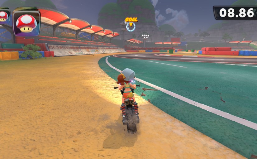
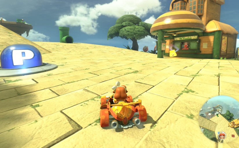
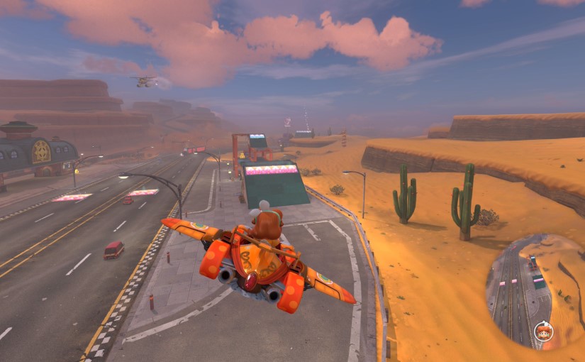
I’ll quickly mention Mario Kart World, RoadCraft, and Dorfromantik, because they’re not really the sort of games you can “complete” but all got a lot of play from me and were games that I played for the first time this year. RoadCraft is a MudRunner-type game where you find yourself in a big truck in the aftermath of a natural disaster and are tasked with repairing roads and pipelines and things, and Dorfromantik is a map-builder where you place tiles next to other tiles and gradually create an expansive landmass while trying not to run out of map pieces. I’m not going to describe Mario Kart World – you know what Mario Kart World is – but you could call these three my honourable mentions.
I’ll also mention Metaphor: ReFantazio, Ys X: Nordics, and Eiyuden Chronicle: Hundred Heroes. I enjoyed all three, but bounced off all three. Metaphor: ReFantazio became a bit of a slog (although I was suffering from excruciating back pain at the time and it hurt to even sit down, so that didn’t help) and Eiyuden Chronicle: Hundred Heroes was just too much faff, as I discuss here. Ys X: Nordics didn’t live up to it’s predecessors and I got distracted. I did still like all three games, though, and may well come back and knock them on the head in 2026.
Anyway, enough preamble, let’s get to the ranking! Watch out, here comes number 25!
25. Princess Peach: Showtime! – Switch
I get that I’m not exactly the target audience for this one, and I don’t really remember what possessed me to buy and play it, but honestly, it was still pretty good even though it’s all the way down here at the bottom. If it was bad, I wouldn’t have bothered finishing it, after all. You play as the second best princess from the Mario franchise and collect different outfits that unlock various powers on your quest to save the theatre or something, and the more action-coded stages were a lot of fun. Some nasty performance issues and some less-interesting sections let this one down.
24. Exo One – PC
A short and sweet Steam purchase that I’d had on my wishlist for some time, this one puts you in control of a technologically advanced space sphere/disc thing and uses momentum-based controls to take you on a ride through beautiful, alien worlds. I smashed the campaign in an afternoon but enjoyed it. There’s a story behind it about a missing astronaut and some mysterious space anomalies, and when the pace was high and the mysteries were mounting it was a thrill ride, but it loses some places for the moments when the controls worked against me and the pace was brought to a near-halt (and it felt a little tiny bit like playing crazy golf).
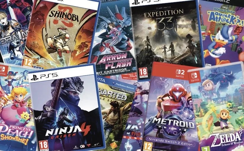
23. Arrow Flash – Mega Drive
A classic shoot-’em-up that I played to completion on my actual Mega Drive in my actual rumpus room. Reviewers of the early ’90s weren’t too impressed, saying that it was too easy and could be completed in an hour or so. I can confirm that this is true, but I still enjoyed it, switching between spaceship and mech forms, and experiencing some trippy visuals and cool tunes. I wouldn’t say it should be mentioned in the same breath as some of the legendary shoot-’em-ups from that era – it’s an early Mega Drive game and it feels like one – but I still enjoyed it.
22. Untitled Goose Game – Switch
I finished it this year but I started it last year and never quite got to the end for some reason. I played it with my daughter this time around, and we enjoyed unleashing our inner aggravating, surly goose personas. Charming and fun, but occasionally a little fiddly and frustrating, this is another game that you can finish in an afternoon. Any game with a dedicated “honk” button is okay in my book.
21. Orcs & Elves – DS
A random eBay pickup that got a few days of solid gameplay out of me. A traditional, first-person dungeon crawler with orcs, skeletons, dragons, zombies, and all that other Dungeons & Dragons-adjacent stuff that gives off cosy, fantasy vibes. It was developed by id Software and published by EA, which I only point out because it just feels quite unexpected. Archaic by design and occasionally esoteric, it’s still an enjoyable and atmospheric experience that I’m glad I picked up.
20. Donald Duck: Quack Attack – PS2
I’ve never really liked Crash Bandicoot. I find the games frustrating and find the character a little grating. I did, however, finish this random PS2 game that’s basically a Crash Bandicoot clone. In general I found it easier and more agreeable than Sony’s then flagship, and I’ll take the cantankerous waterfowl over the wacky marsupial any day of the week. Surprisingly good music, too. The game is known as Donald Duck: Goin’ Quackers in America.
19. The Precinct – PS5
I did a Game Diary on it here and it was a gift from my daughter for Father’s Day, which makes it super special to me. The Precinct has a great soundtrack and a cool, retro top-down view that brings to mind the original couple of GTA games. When it works, it’s all delightful chaos and ’80s vibes, but it had a few too many bugs and random odd NPC behaviours that took me out of the zone. Still, it produced plenty of hilarious emergent moments that make me smirk to look back on.
18. Captain Toad: Treasure Tracker – Switch
A game that I love the idea of slightly more than I love the execution of, but I did still really enjoy this sentient fungus-based puzzler. The compact worlds are cosy and visually interesting, and the brain-teasing gameplay is on point, with lots of additional content made available in the Switch version. I did occasionally find it a bit slow-going and wished my little mushroom pal could run a bit faster, and when played in cooperative mode with my daughter we found that the motion controls could be a pain in the arse. Still great, though.
17. Broken Sword – Shadow of the Templars: Reforged – Switch
I found it especially difficult to rank this one as Broken Sword is one of my all-time favourite game series’ and a go-to for YouTube lets plays when I can’t sleep, but re-playing this in its modern incarnation I couldn’t help but notice where the cracks are starting to show, and feel that if I didn’t have the nostalgia and the pre-knowledge of what to do going in, I would’ve got frustrated and given up. Still, impeccable atmosphere, and George Stobbart’s voice is one of the comfiest in gaming for my money.
16. Uncharted: Golden Abyss – PS Vita
Now for a more action-based take on the globe-trotting adventure genre, as Nathan Drake is responsible for uncountable murders while George Stobbart is still on a big fat zero. This handheld iteration manages to take everything that’s enjoyable about the Uncharted franchise – the spectacle, the atmosphere, the fast-flowing, ever-changing gameplay – and shrink it down to handheld size. I didn’t always want to be fiddling with the touch-screen and gyroscope, however, and the smaller screen took away from the “blockbuster” feel the series is known for.
15. Kena: Bridge of Spirits – PS5
I wrote about this one here, but to put it more succinctly; it’s a somewhat Zelda-adjacent adventure with a Dreamworks-inspired visual style, surprisingly deep and difficult combat, and adorable little critters to locate and manipulate (and put hats on). It was graphically stunning at times and enjoyable throughout, but I didn’t feel much of a connection with the protagonist and the side characters. Still, a great experience from beginning to end.
14. The Plucky Squire – Switch
The short and quirky tale of a young squire kicked out of his storybook, this game delighted with its writing, charm, and Zelda-like gameplay. I finished it right at the end of the year to take my number of games completed (for the first time) in 2025 up from a nondescript 24 to a thematically pleasing 25, and thanks to its imaginative design, clever puzzles, and some amusing dialogue and visual storytelling, I had a very good time doing so. A humble but entertaining slice of wholesome and colourful video game fun. I wrote about it here.
13. Drainus – Switch
Honestly, I didn’t spend anywhere near as many hours on this one as I did the likes of Kena: Bridge of Spirits and The Precinct, but I did thoroughly enjoy every moment, and it was so nice to play a mechanically near-perfect shoot-’em-up with awesome graphics and music that I could actually get through. The best of the “short” games I played this year, Drainus definitely has a lot to offer for high-score chasers and self-challengers. I, however, just like the pew pew pew. I wrote about it in more depth here.
12. Super Princess Peach – DS
Probably my pleasant surprise of the year, I saw that a lot of contemporary reviewers were generally unimpressed with Peach’s first solo outing, but I found it to be a wonderful balance of accessible platforming, visual charm, neat music, and semi-sneakily hidden collectibles. Not too difficult but with some mildly challenging moments, this title kept me interested until the end and more than delivered on what I was expecting from it; a visually pleasing and well-crafted casual platformer experience.
11. Uncharted: The Lost Legacy – PS4
After having an agreeable time with Uncharted: Golden Abyss I decided to continue my Uncharted adventure by picking up this super-cheap and expertly-crafted thrill-ride and smashing the campaign over a few sessions. I enjoyed playing as Chloe for a change (and I always enjoy Claudia Black’s voice work), and found the set-pieces as exciting as always. I also appreciated the downtime, snooping around spectacular ruins and breathtaking vistas in search of treasures and trinkets. Short but very sweet, and with a nice ending where everyone enjoyed some pizza.
10. Super Mario Bros. Wonder – Switch
For my money, Sonic is the king of the 2D platformer. Having said that, I did find this endlessly inventive platform experience to be a fun and challenging ride. The Wonder Flower effects added such a surreal tone to the game that it always felt like anything could happen, and it let me play as Daisy, so that automatically puts it above the two Peach games I’ve already talked about. Daisy is the best princess, after all. A worthy way to kick off the top ten.
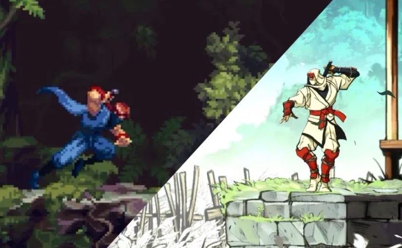
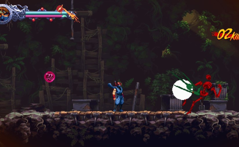
9. Ninja Gaiden: Ragebound – Switch
The first ninja-based game to appear on the list, this one stayed true to its NES roots while modernising the gameplay in a few key ways that resulted in a fun and challenging experience. I enjoyed the interplay between the two playable characters and found the bosses to be quite demanding, but wasn’t overly enamoured with the visuals and never felt too compelled to go back once I’d got the campaign in the bag. Still a top-quality, retro ninja adventure, though.
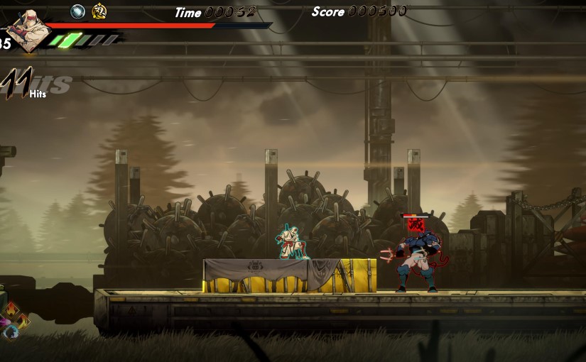
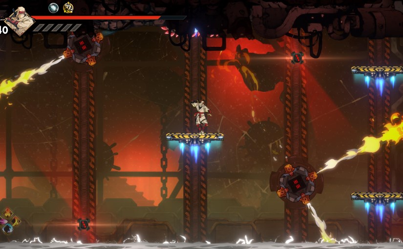
8. Ninja Gaiden 4 – PS5
This game should have been challenging for the number one spot but was honestly a little disappointing. The visuals are great, the combat is poised, tight, and brutal, and the violence is satisfying, but compared to Ninja Gaiden and Ninja Gaiden II it lacked variety and x-factor, and the new protagonist, Yakumo, came across as a socially-awkward emo-kid who all the female characters and some far-cooler male characters seem to have nothing but respect and adoration for despite his complete lack of charisma. It played brilliantly, but the game, like its hero, lacked personality.
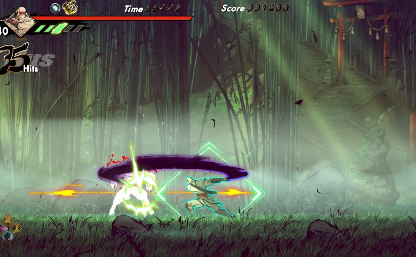
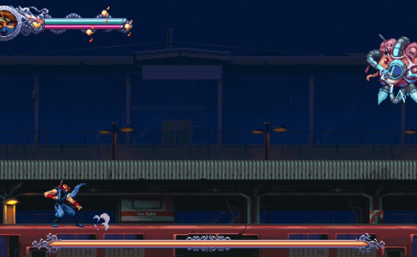
7. Shinobi: Art of Vengeance – PS5
The triumvirate of ninja action games concludes with Shinobi: Art of Vengeance, which just won me over with its awesome presentation, animation, combat, and controls. The platforming was really solid too, and I enjoyed the Metroidvania-lite mechanics. An excellent return to the limelight for a classic Sega character that warmed the cockles, but some of the levels felt a bit underwhelming and some of the backgrounds felt a bit lacking in detail. I guess I’m still just a bit salty that the gross, body horror sections weren’t disgusting enough. I wrote about this game and Ninja Gaiden: Ragebound here.
6. The Legend of Zelda: Echoes of Wisdom – Switch
With Tears of the Kingdom and the Link’s Awakening remake still in my unfinished pile, I wasn’t betting on myself to get through this one, but the quirky gameplay and charm carried me right through to the end. I had a great time summoning creatures and items to help with traversal, puzzles, and combat, and adored the atmosphere and visual style. I’m pretty sure I played the entire thing through in handheld mode, and it really worked beautifully as a handheld adventure that kept me occupied for hours. I didn’t even mind the menu interface thing that everyone was complaining about. Good stuff.
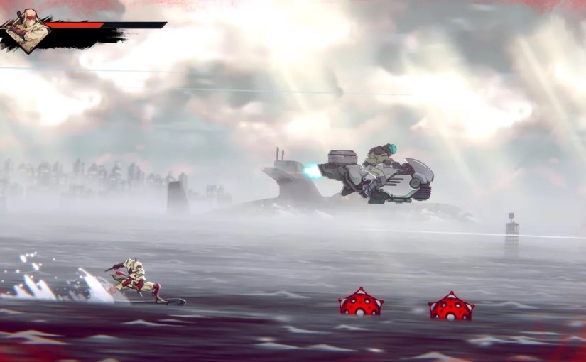
5. Prodeus – Switch
The first game I finished in 2025 was this gem of a “boomer shooter”. I wrote about it here, and while I haven’t played it since knocking the campaign on the head in January, it’s definitely one I can see myself blasting through again in the future. Feeling somewhere in between Doom and Quake with a few mod-cons strapped on, Prodeus was an extremely enjoyable romp through sinister enemies and grimy stages overflowing with ominous atmosphere. It was just a really visceral old-school FPS that I look back on with great fondness. Top five material.
4. Metal Slug Tactics – Switch
I’d read about this game (and watched a few videos) before it was released physically, and knew to expect an experience close to the excellent Into the Breach before sticking the cartridge in, so it had a lot to live up to. Thankfully, it turned out to be a very fun and finely balanced strategy roguelike with just the right amount of challenge. Full of personality, Metal Slug Tactics recreates the classic Metal Slug art-style admirably from an isometric perspective, and has some really cool music too. I often go back to Into the Breach, but now I have another option to sate that hankering for tactical grid-based goodness.
3. Metroid Prime 4: Beyond – Switch 2
My final anticipated release of the year, it lived up to my expectations and provided a beautiful and atmospheric space adventure that had far fewer frustrating moments compared to Metroid Prime Remastered. I wrote about it in more detail here, but I found that a lot of the problems people are talking about online – like the radio buddy and the green crystal hunt – didn’t bug me anywhere near as much as they seem to be offending other people, and I found Samus’ latest outing to be a top-quality experience from beginning to end.
2. Prince of Persia: The Lost Crown – PS5
I never expected this to rank so high, but when your biggest complaint about a game is that everyone seems really tall compared to the protagonist, then you know you’re onto a winner (everyone does seem so much taller than poor old Sargon though, and it does really bug me because seriously what is up with that?). I did a game diary on it here, and I look back on that time spent with the game very fondly. Great combat, satisfying puzzle solving and progression, and an awesomely charismatic protagonist all combine to form a brilliant Metroidvania experience. It’s super-cheap, too.
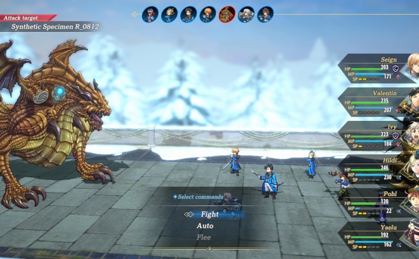
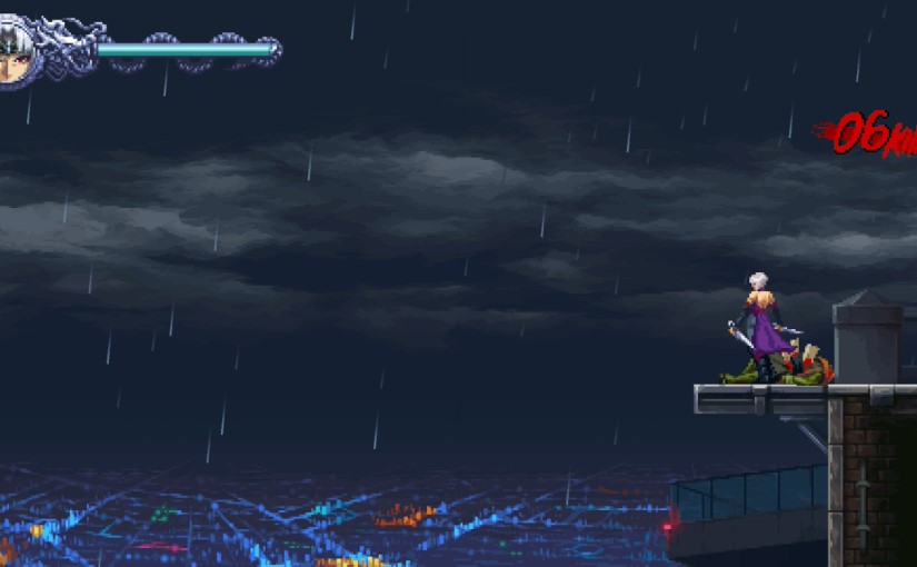
1. Clair Obscur: Expedition 33 – PS5
Recent controversies from the Indie Game Awards aside, this has to be my GOTY, and I previously wrote about it here. A fascinating premise that was followed up on beautifully, gorgeous visuals, stunning music, and challenging gameplay that made the whole thing feel way more involved than your average turn-based RPG (not that there’s anything wrong with a traditional turn-based battle system). The passion of the developers is palpable throughout the game’s rollercoaster of a campaign, and I think it’ll live on as one of the true greats in years to come.