Wanna Talk Box Art? I’ve Got You Covered
One of the many reasons I fear the day when digital distribution replaces the physical game entirely, is that we’ll lose the establishment that is video game box art. I’ve been thinking a lot about video game cover art lately, and have indeed been looking at a lot of video game cover art, too. I’m looking at the cover of Fantasy World Dizzy right now, in fact. This timeless piece of artwork shows an egg in boxing gloves, wearing a safari hat and holding a telescope, while dragons and dinosaurs loom threateningly in the background. It’s a completely normal cover for a completely normal game, and it’s just the tip of the box art iceberg. From Wipeout to Alan Wake to Gravity Rush to Double Dragon, there’s a huge variety of great cover art out there, and I’m going to put on my world-renowned art critic shoes and talk about some now.
I’m also going to highlight a few that I really dislike. Then I’ll probably get called out on it and feel bad about it, but that’s just the kind of thing that us world-renowned art critics have to deal with every day. Let’s just look at some covers, shall we?
GOOD – Deus Ex
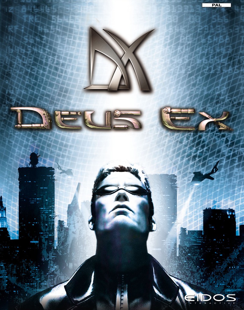
The box art of Deus Ex pleases me. There are a few aspects that come together to give an unmistakable dystopian, cyberpunk feel, but it’s that ambiguous beam of light that really peaks my interest. Has JC Denton been picked out by a spotlight? Or is he ascending into some higher state of cybernetically-enhanced existence? The grid and stream of numbers overlaying the sky could be a representation of the all-encompassing grasp of technology, or could hint that this whole world is a simulation. Either way, with its black helicopter, bleak cityscape, shades-at-night-time vibe, this box art has all the ingredients needed to get you into the conspiracy mindset. Corporate subterfuge, government cover-ups and dehumanising body modification are surely just around the corner.
GOOD – Sonic & Knuckles
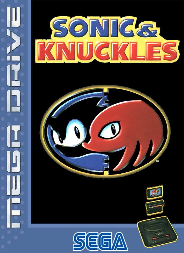
Before Sonic’s video game world was filled with superfluous bats, cats, bees, and miscellaneous additional residuary hedgehogs, a new character was a big deal that people looked forward to. Tails’ introduction in Sonic the Hedgehog 2 was a serious event, as was Sonic the Hedgehog 3’s unveiling of the mysterious, antagonistic echidna, Knuckles. When Sonic & Knuckles hit the shelves, and people knew that they were finally going to be able to play as the prickly, pink anti-hero, this minimal box art did all it needed to do. An elegant logo on a black background, depicting Sonic and his new frenemy. It’s simple, it’s pretty, and it works. This is graphic design, people. I’m surprised I never see it on hoodies.
BAD – Days Gone
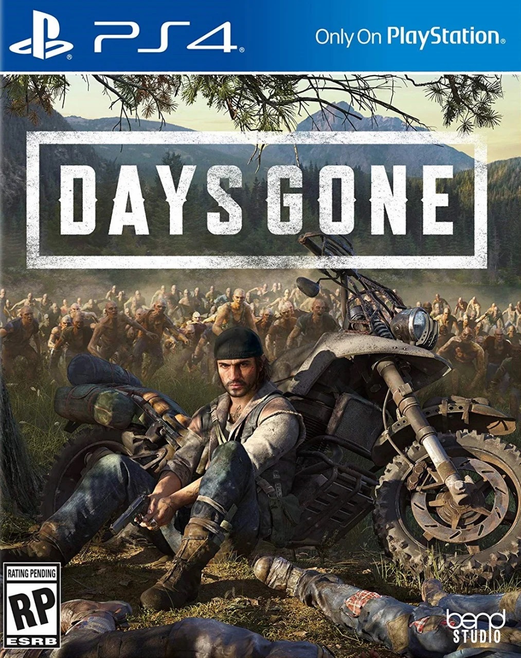
Days Gone has a stupid box art. This thing was designed by a committee, or some kind of cover-designing computer program. The “cover-o-matic”, if you will. Someone typed “zombie horde, brooding protagonist, 42% Sons of Anarchy, 58% The Walking Dead” into the algorithm and this is what came out. No one noticed that the computer didn’t understand that the lead wouldn’t be sitting and brooding handsomely next to his bike while a horde of infected looms only a few metres away. It’s a dumb and meaningless cover that just ticks all the triple-A, cinematic, gritty Netflix series-inspired boxes of its era. Don’t blame the cover-o-matic, though. It just does what it’s told.
BAD – Eternal Ring
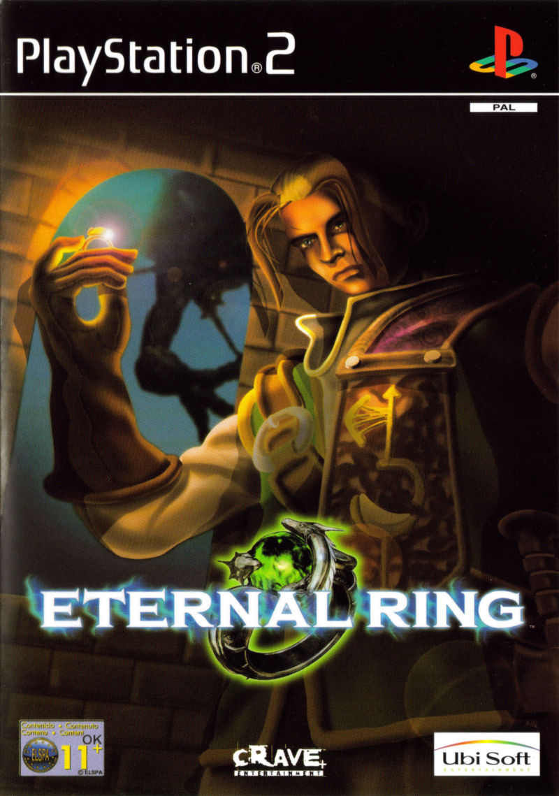
Look, I don’t want to knock a developing artist, but I also think that a certain level of refinement should be required when producing the cover art for an officially-released video game. Eternal Ring is FromSoftware’s original ring-based action RPG that a lot of people don’t know about, and honestly, I don’t think I’d know anything about it either if its cover art hadn’t stuck with me for all the wrong reasons. There’s nothing wrong with the image choice of a guy contemplating a ring for a game that presumably features a ring that’s worth contemplating, but why the hell wasn’t I producing covers for worldwide video game releases in the year 2000? I possessed a similar level of anatomical drawing understanding, and I’m pretty sure I was better at hands.
GOOD – The Legend of Zelda: Breath of the Wild (NA Cover)
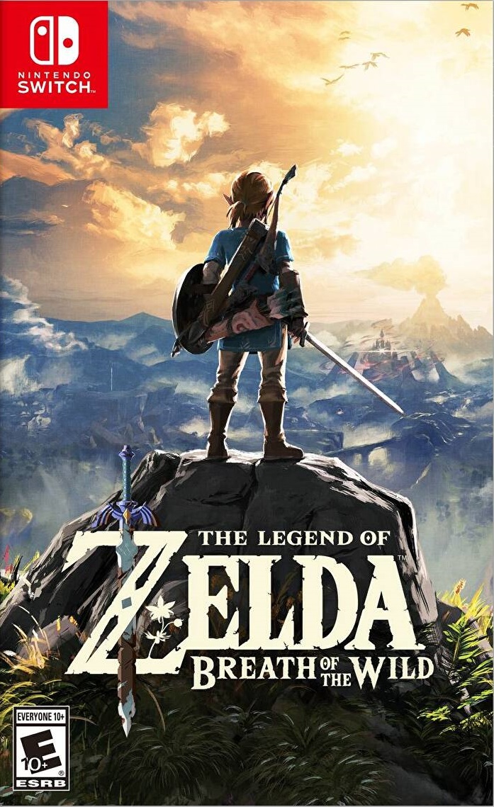 Historically, the Zelda franchise has gone for a prominent logo on a plain or minimal background for its box art, and I’ve seen folks online identifying these as both the best and worst things ever. I like them, but I like this one more. The logo is right there, looking lovely as ever, but it’s backed up by an image that embodies impending adventure. Link, wearing a brand new, blue tunic, stands on a rocky outcrop like someone’s expertly-painted Warhammer miniature, and a world of opportunity awaits before him. This cover represents an exciting new era for one of the world’s premier video game franchises, and invites you along for the ride.
BAD – Planescape: Torment
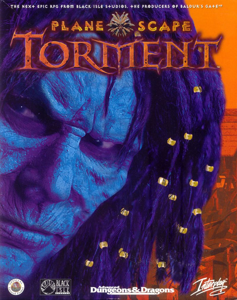
I love Planescape: Torment. I do. It’s got the greatest story ever told in gaming and I’ll die on that hill all day. Not many people experienced said yarn, however, and while its status as a cult classic PC RPG that sits in the shadow of the likes of Baldur’s Gate and Fallout 2 definitely had something to do with this, this super-weird front cover surely contributed to its obscurity. I mean, what were players supposed to expect when they laid eyes on it? It looks like an alien from a voodoo magic-inspired episode of some obscure, ’90s sci-fi, which I guess would have its charm if that’s the kind of vibe Planescape: Torment was going for, but it really isn’t. The ’90s sci-fi makeup job, the blue scaling, the picked-out gold on the dreadlock beads, it’s all so weird and off-putting. Great game, though. Honestly.
GOOD – The NewZealand Story
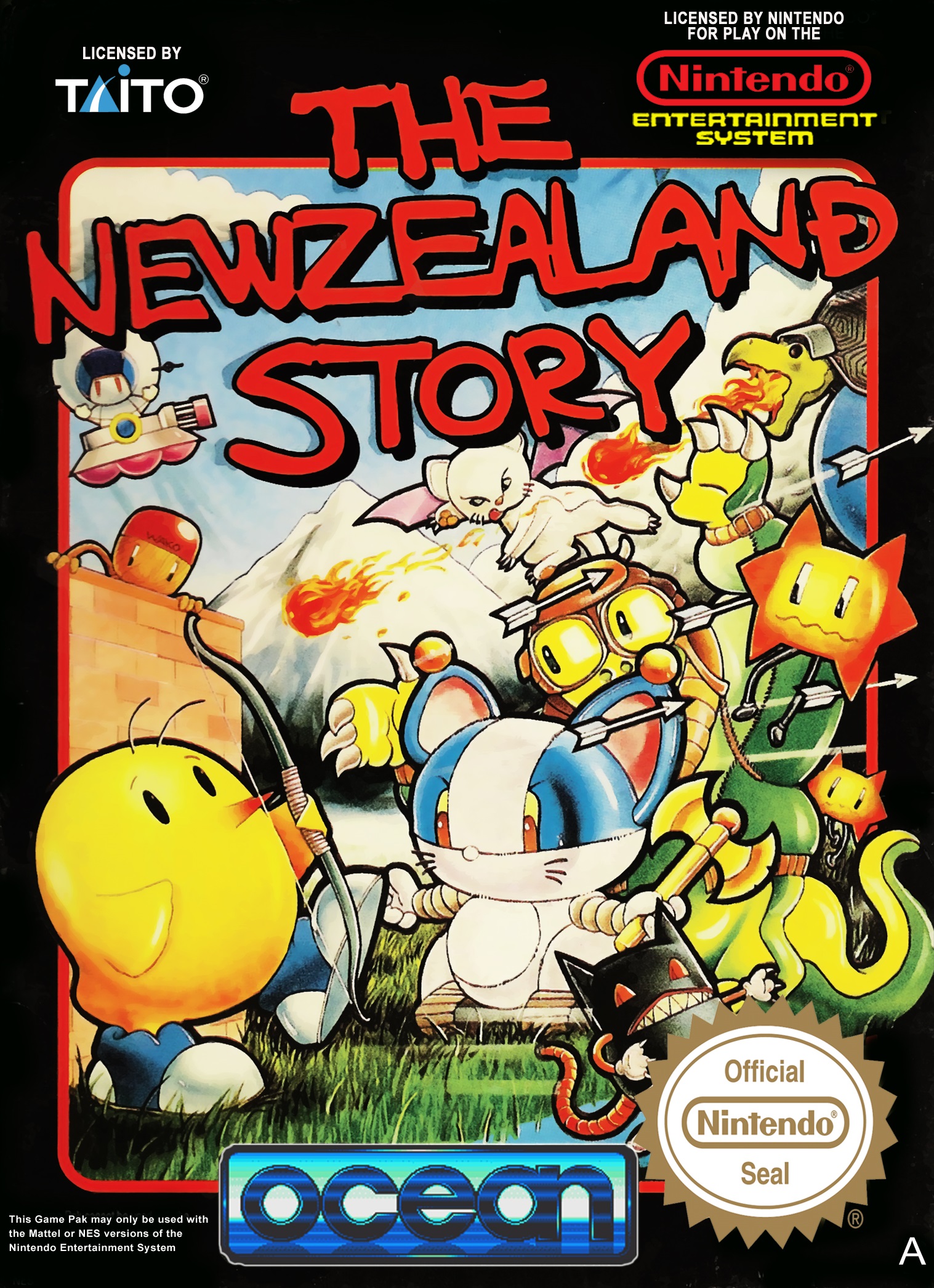 My pick of the bunch when it comes to cutesy platformer box art is the adorable and mysterious The NewZealand Story. Let’s have a look at some of the characters arrayed on this cover, shall we? You’ve got Tiki the kiwi himself, looking adorably heroic in his trainers, then there’s a whole host of critters standing in opposition. There’s a thing in a floating UFO tank, there’s a kind of sinister-looking, fire-breathing tortoise, there’s a cat-like creature with bat wings, and there’s an absolutely beautiful little bat-mouse thing in the bottom corner, standing there looking like some kind of proto-Gengar. It’s a cuddly yet action-packed composition, and thankfully, that creepy, pink whale boss is nowhere to be seen.
GOOD – Streets of Rage
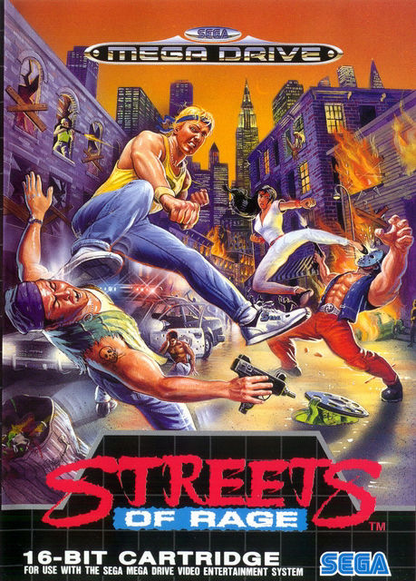 I love a side-scrolling beat-’em-up, and the genre has provided some epic cover art over the years, from the various ports of 1986’s Renegade, right up to the recent Teenage Mutant Ninja Turtles: Shredder’s Revenge. The original Streets of Rage has to be the pinnacle, though. A perfect example of ’90s action movie-style, illustrated box art, this expertly-composed picture has it all. It’s not entirely representational of the game, though. I don’t know why Blaze and Axel have changed their outfits, and no bad guys carry Uzis, wear hockey masks, snipe from windows or emerge from beneath sewer covers (not until the second game, anyway), but who cares when the image is so awesome? I own a cushion with this artwork on it. No word of a lie. I’m leaning on it now, in fact.
BAD – The Last of Us Part II
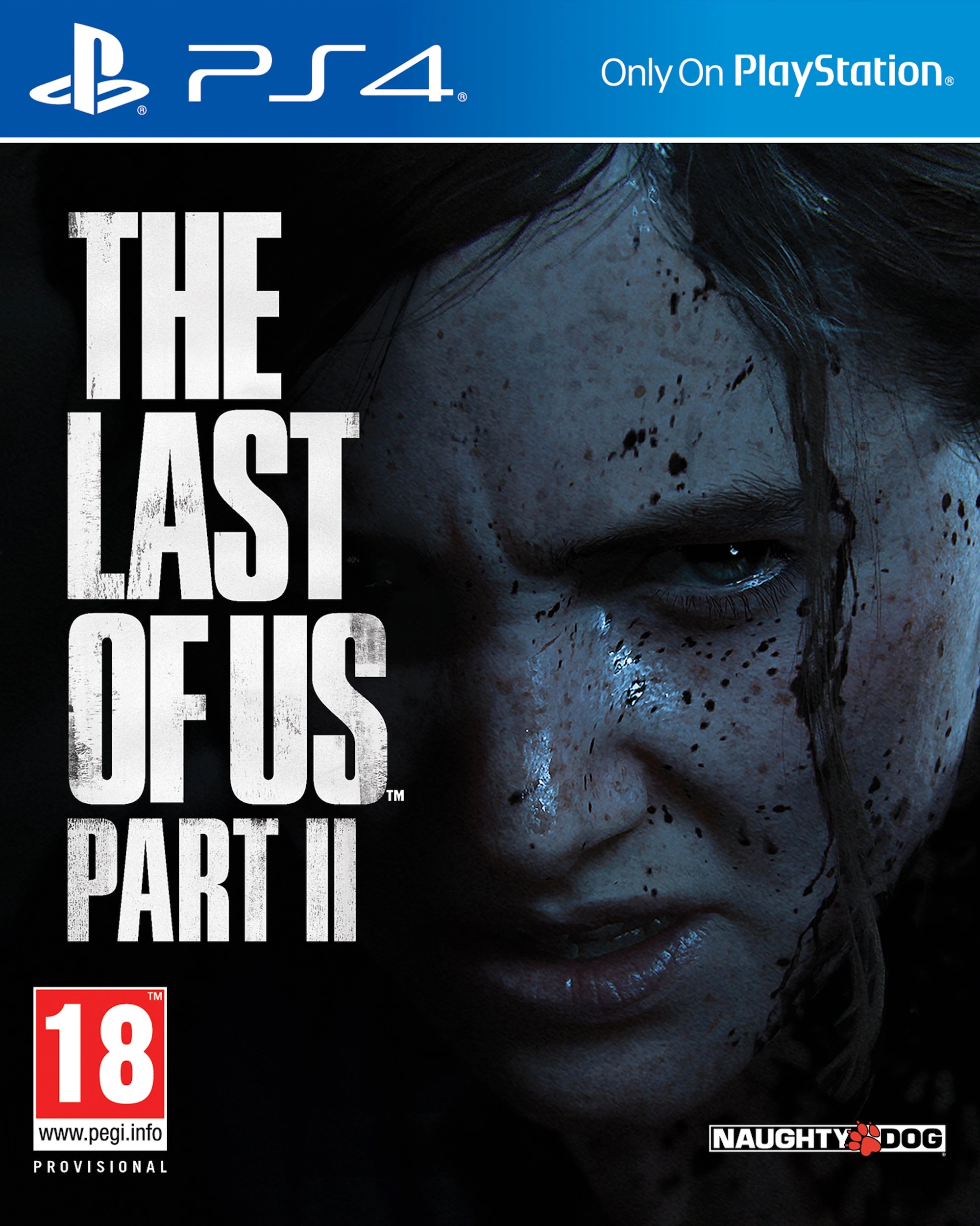
Sony’s big exclusives really do run the gamut of cover quality. Horizon Zero Dawn is great, God of War is alright, Days Gone can get in the bin, and then you have this. “Close up of grumpy face”. I don’t know what else to say, really, it’s just another meaningless cover that ticks market research boxes but in an even less interesting way. I totally get it, The Last of Us Part II cover designer, your game is gritty and violent and harsh. It’s basically misery porn and I understand that some people like that, but I really don’t want “close up of grumpy face” on my gaming shelf. Take your blood-soaked, angry teenagers and ludonarrative dissonance elsewhere, please. Can I look at something else now?
GOOD – Cisco Heat
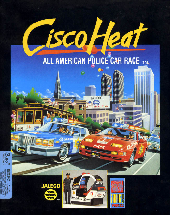 Now, this is more like it! I used to pick up Commodore 64 magazines when I was younger, and I always loved seeing the cover art and advertisements for Cisco Heat in said periodicals. It embodies my childhood idea of what America was like; sun and skyscrapers and cool police chases. When I look at this image, I think of summer, I think of rolling my Micro Machines around my bedroom floor, I think of watching Police Academy on video. Look at that subtitle – “All American Police Car Race”. That’s the stuff that my young, Beverly Hills Cop-inspired dreams were made of. And yes, I do also like the photo of the cop leaning on the cop car arcade machine. Who wouldn’t like that? Criminals, that’s who.
GOOD – Halo 3
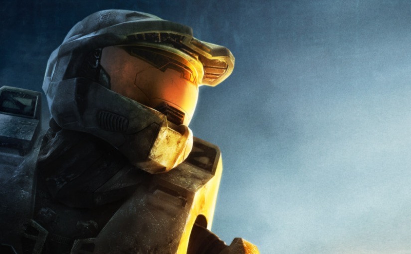
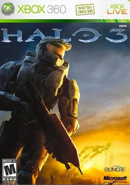 You could say, if you were so inclined, that the Halo 3 cover represents everything that’s wrong with big budget game covers from its era and beyond. It’s just the main character kind of standing there with a gun, it’s got that whole orange and teal, generic movie poster thing going on, but none of that matters, this is a masterpiece. Every subtle nuance combines to form a piece of box art that’s so inspiring it should be made into a 100 foot stained glass window and installed into a magnificent cathedral so that the morning sun can shine through it, reminding us of the trials and sacrifices of our saviour, Master Chief. The light, the shadows, the perfectly-poised, pre-action pose. This cover isn’t just epic, it’s transcendent. It depicts the precise moment that the ultimate hero of mankind steps into the light, ready to save us all.
GOOD – Secret of Mana
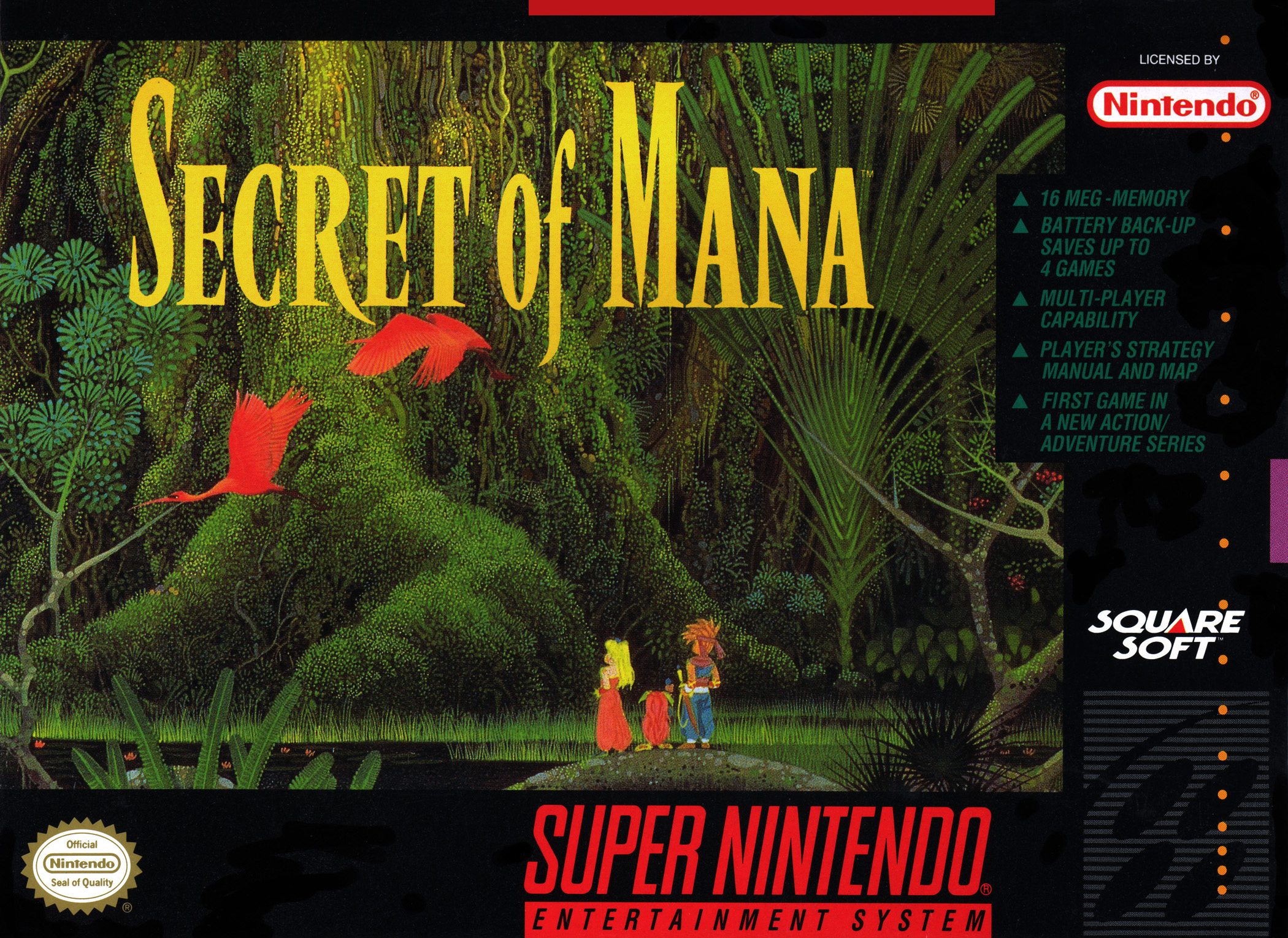 Hiro Isono was an incredible artist. His illustrations of otherworldly groves and mystical glades capture the complexity and detail of nature as well as its mysterious, sweeping majesty. When the lads at SquareSoft hit him up for a bit of cover art back in the early ’90s, it was an inspired move. After all, the driving force behind the lore of Secret of Mana is a giant, magical tree, and Isono is giant, magical trees. The result is a beautiful, somehow eerie, contemplative piece of art that details an event later in the game in a way that doesn’t spoil the story. It has the three leads, it has the roots of an enormous tree, it has some cool birds, and it’s so much more affecting than a picture of the protagonist posing with a sword (or an extreme close up of their grumpy face). The PS4 remake has more room on the cover to feature more of the illustration, so I should probably have displayed that one, but the SNES box presses all my nostalgia buttons. It’s my favourite box art, and I can’t see it being uprooted any time soon.
